New format to see the backgrounds
I think the new look is good, but I have a suggestion that might bring both worlds together. What if when you hover over the mossms the popup box has a larger picture of the mossm with a bit more information and larger text? This way the general layout can stay the same but the hover box could be larger.
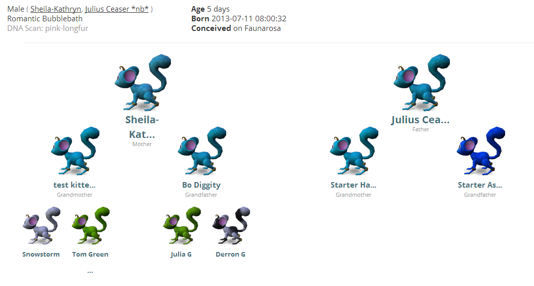
i love the family tree look, that is what i wanted from the begining
but i noticed on mine that i can't see the names of the mossms, so perhaps, add that to the bubble u get when you hovertext ?
like http://mossms.com/p/Zermit.vasilopita/mossm/Duke.of.Earle/
i can't see the parents names on the page
see: http://zermit.us/img/mossmtree-fix.PNG (this pic is bigger than my real view, odd it screenshoted that way)
cause if it do that for the parents, you can guess the hell for the great grandparents when they get to see that
and for the record, Sheila-Kathryn was born with that name, i kept it cause it was like wow well ok.... so it's a thought since that name is in your system to have it so atleast the parents if using a default name would show
i really like the new tree, much more clear on who's who's background. thnx for changing it!
Maybe you could add a setting for people to choose size? for instance if you got big resolution you might want it bigger and if you got small res you might want it smaller... been a while since I did webpages but don't think this would be impossible to implement.
As for the new tree I love it but I can see how its hard for auctioneers now to read out each one as they gotta mouse over etc. I think it's much easier to see the lines now and see where I need to do a snip snip to make my lines nicer.
Why not just make them all the same size as the largest one? We get the idea of where they belong in the tree, they don't need to be smaller as the tree goes down.... just my two cents =)
I've just updated the family tree again based on feedback. Hopefully, you like the new one a little better. The mossms are larger, the text is larger, and their positioning has been adjusted. We've also put the names of the mossms into the popup, to help when mossm names got truncated, and increased how big names can get before truncating, and dozen other tiny details.
It looks good to me :)
I'm enjoying how efficient you are at implementing suggested changes that most of the community agree on! Kudos!
You must login to reply.
July 16, 2013
10 years, 10 months ago
I too like the family tree - I just don't like squinting at the pics and text hehe